6/29/2011
1/05/2010
Nexus One has 2.5x the resolution of the iPhone's screen.

It is amazing how you could fit two and a half iPhone home screens. The new iPhone better have a similar screen resolution in order to compete, and let's not go into the AMOLED thing.
Click on the next image to see how beautiful 480x800 is. It must look pretty sharp on real device size.

10/27/2009
New mouse, less buttons... or better put, no buttons.
The replacement to the fugly and useless apple "mighty" mouse is finally here, this time with no buttons yet mightier than its predecessor. It is called Magic Mouse. The whole surface is actually clickable and through software and through its capacitive multi-touch new surface it is able to detect if you do a right click or left click. Gone are the squeeze side buttons to enable exposé and the middle click button on the scroll ball of the Mighty Mouse.
Through gestures you can now scroll, swipe and navigate back and forth through websites and pictures. What you can't do with the Magic Mouse is rotating gestures like on the MacBooks' touchpads and neither the pinch to zoom in or zoom out. Hopefully they could add those gestures in the future but apparently they can't be performed too well since you have to still be holding the mouse with your other fingers.
The mouse comes by default on the new iMacs or can be purchased separately by $69. It is bluetooth and the battery lasts 4 months according to apple.
7/29/2008
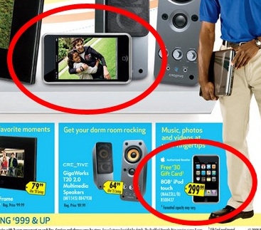
New iPod Touch leaked in BestBuy ad?
Last weekend I was given one of those BestBuy weekly ads and I noticed there was an iPod Touch but it looked different, it looked like an iPhone with a silver bezel around. No, it didn't look chromed but only silver. I went to BestBuy's website to see if they were using the same picture for the item but they have the regular picture of the iPod Touch with the black frame which by the reflection of the light might give the illusion of not being black, but look at the picture I made comparing both versions, they are definitely different.


12/08/2007
Bringing the old Front Row to Leopard with Leopard-Style
One thing that has been really bugging me since I upgraded to Leopard is Front Row. Front Row seems to me like big step backwards from Apple. I have never liked its AppleTV-esque interface that much. When I read that Apple would be bringing AppleTV's inferface to the new Front Row in Leopard I though it would be still as nice as the old one. I was wrong. The new Front Row no longer has that cool transition when launching and closing. I loved the old icon-spinning entrance and the desktop fading out. When choosing any of the options, the old Front Row had a very smooth and nice transition of the icons, now in Leopard they are fast and with a sharp and ugly movement. Also, the fonts in the new Front Row are smaller and may be harder to read for some. If you are playing music in iTunes and you launch Front Row the music stops, and if you are listening to music in Front Row and then exit, the music stops as well. The problem is that doesn't have the "Now Playing" option so now I can't play music directly from my iPod. Well there are lots of things that I don't like from the new Front Row and I have read the same complaints from other people. Thankfully I read some where that it was possible to replace Leopard's front Row with the Tiger's Front Row and I immediately did it on my MacBook but then I noticed it didn't look new anymore so I decided to do some "modding". I replaced all of the icons of Tiger's Front Row for the new icons in Leopard. The same functionality that I have always loved with a slightly new look. Some will say it doesn't look like different other than the "Videos" icon, but if you pay attention to the other icons you can see how the iPhoto icon has the new digital camera and the DVD icon from Leopard is different too.
Okay, If you want this modded version of Front Row download this file and uncompress it. Now, make sure Front Row is not running. You can see if it is running by launching Activity Monitor and look for "Front Row", if it is running just quit the application.
Then go to /System/Library/CoreServices/ and look for Front Row.app and store it somewhere else so you can have it in case you want it back. Now place the Front Row.app you
just uncompressed to this folder and that's it. You don't even have to restart.
Here are some pictures of the original Tiger Front Row and the modded version of it.
EDIT: The link to download the file is working. You can click here as well to download it : http://www.mediafire.com/download/php?t33ghu14cmz
2ND EDIT 2010: I don't know if this longer works in Leopard with so many updates to Leopard, iTunes and Quicktime. I'm unaware even more if it works under Snow Leopard. Warned!
(Not Compatible with Microsoft Windows)
Subscribe to:
Posts (Atom)